Work
HITOHI (COMION)
- BrCI.
creative studio OUWN
HITOHI (COMION)
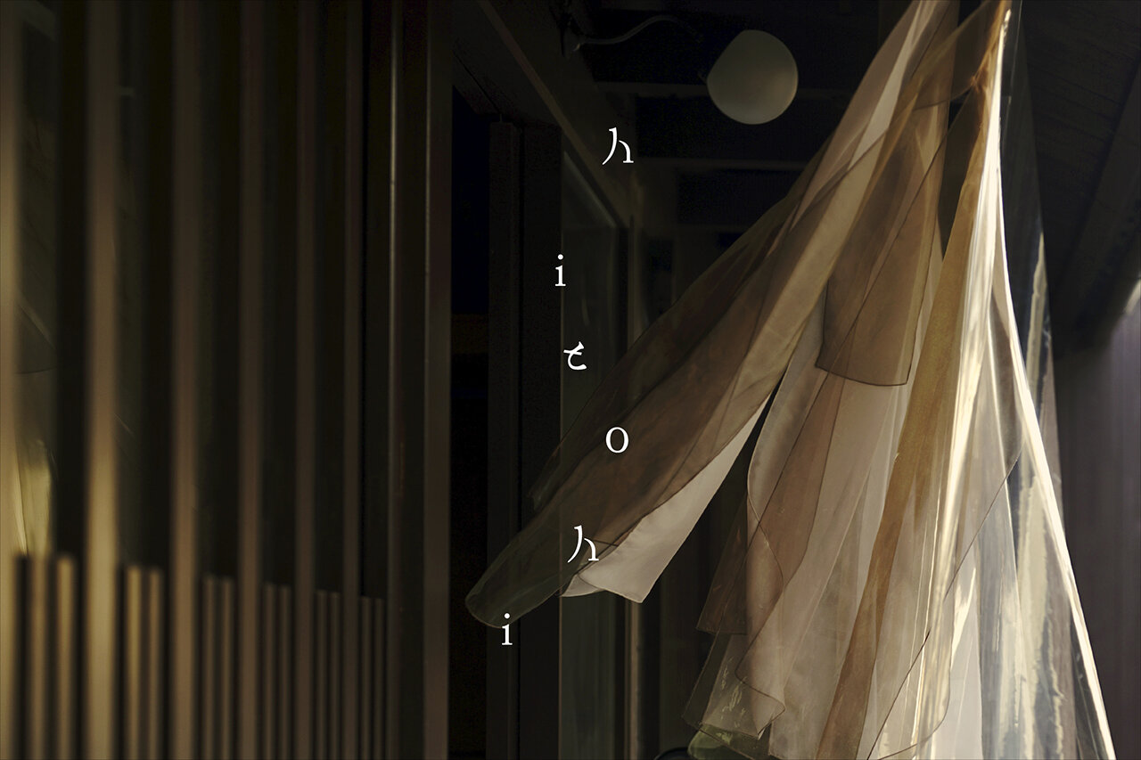
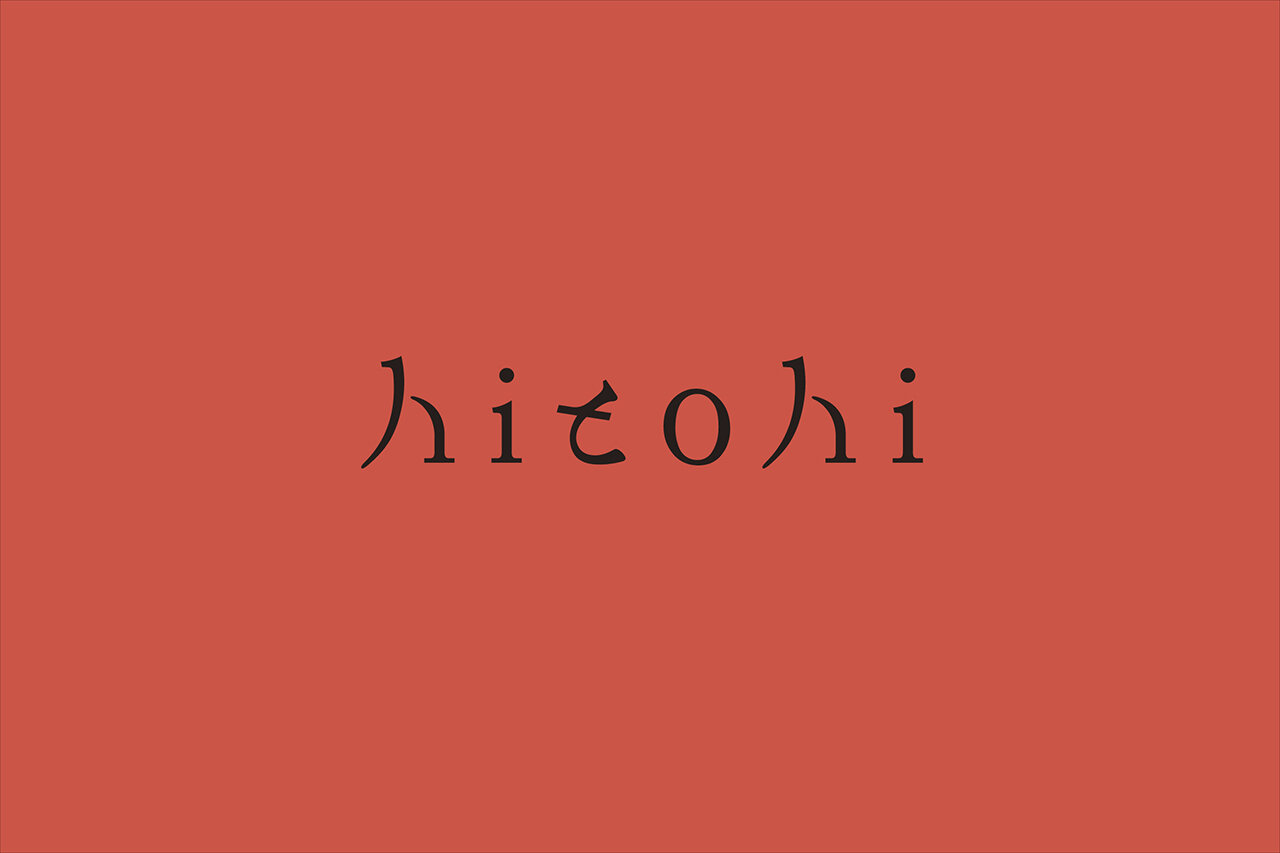
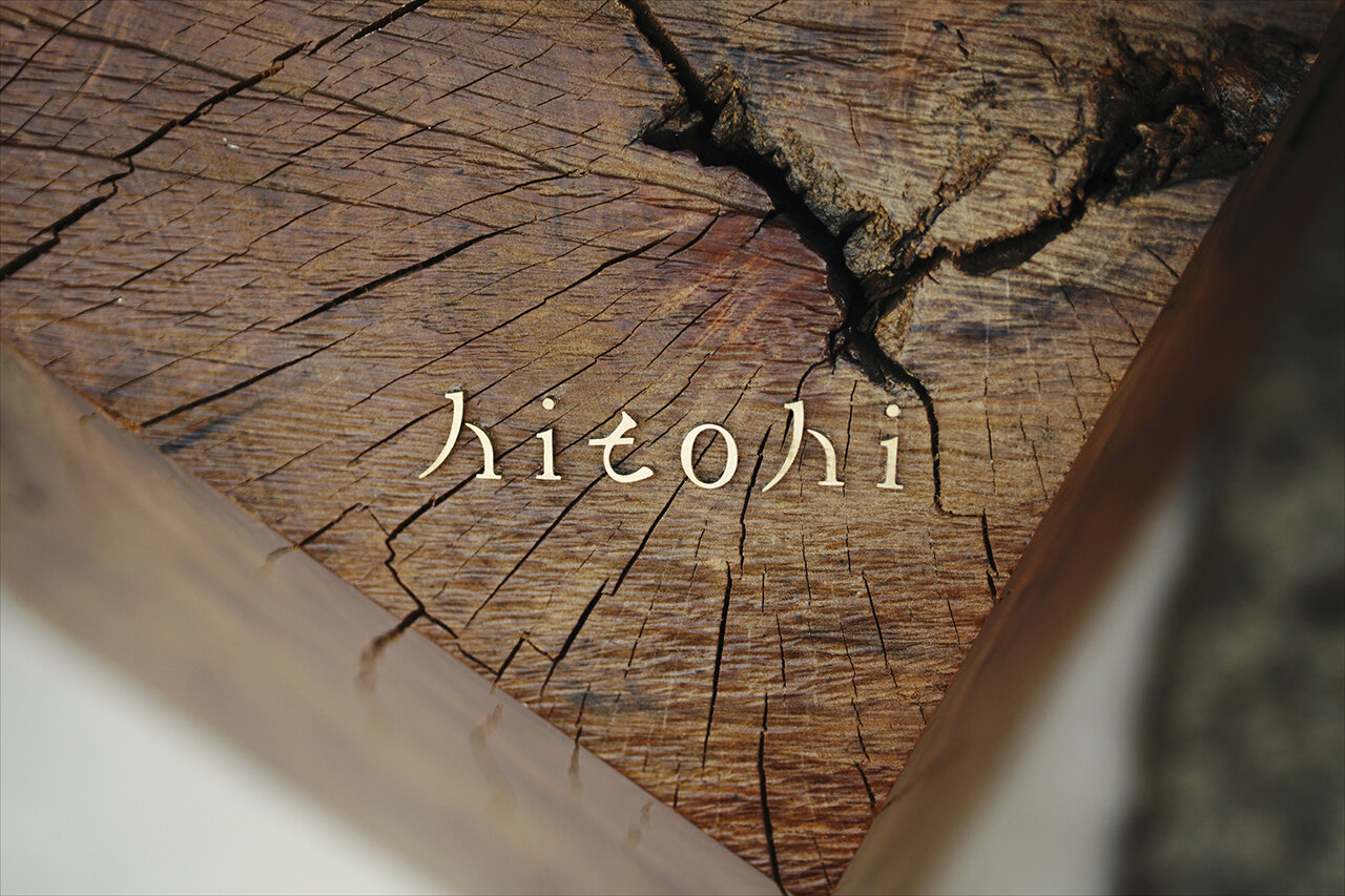
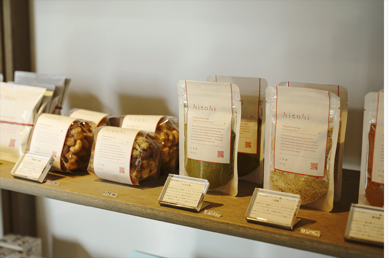
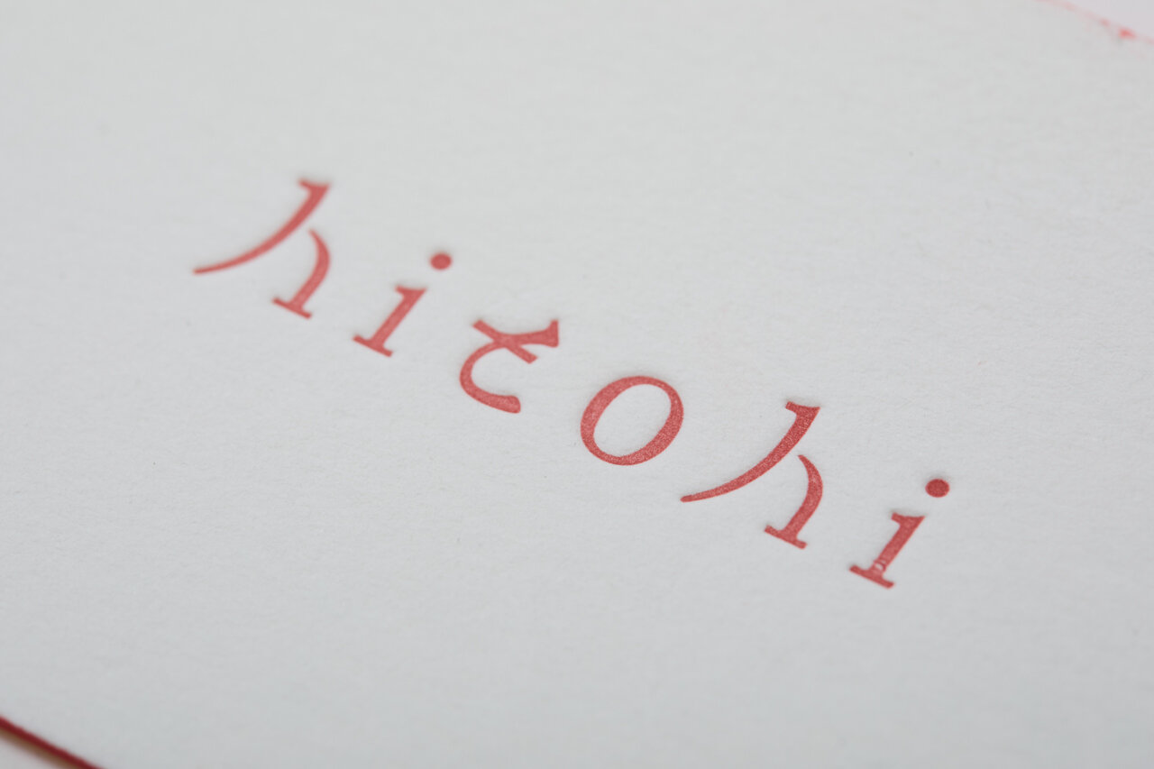
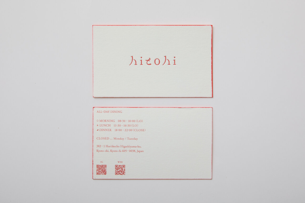
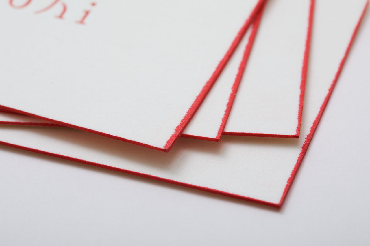
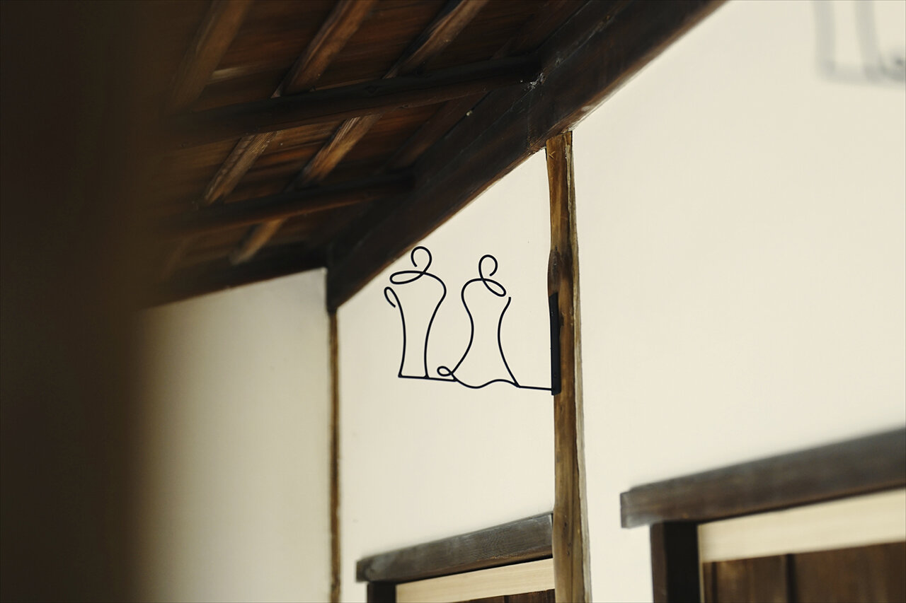


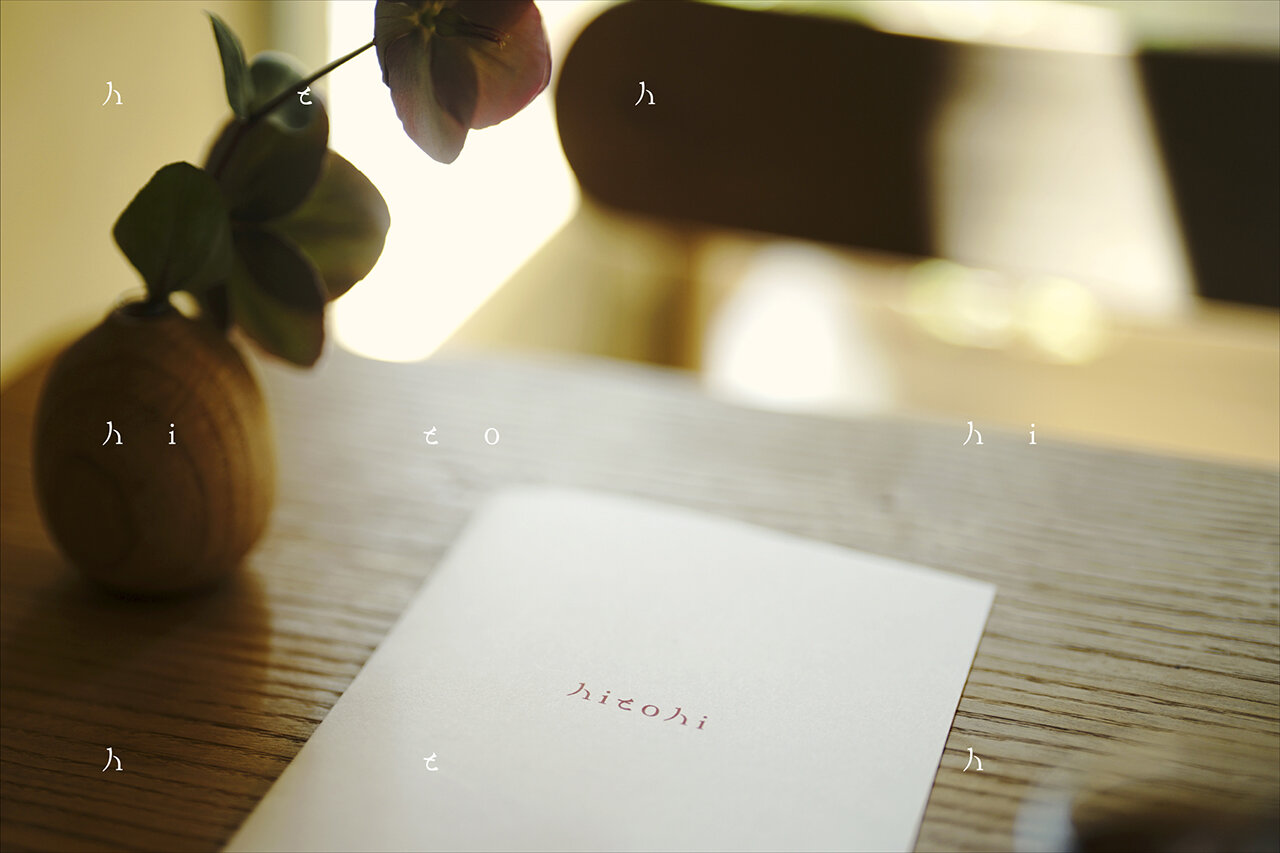
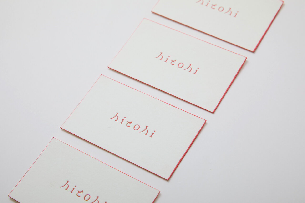
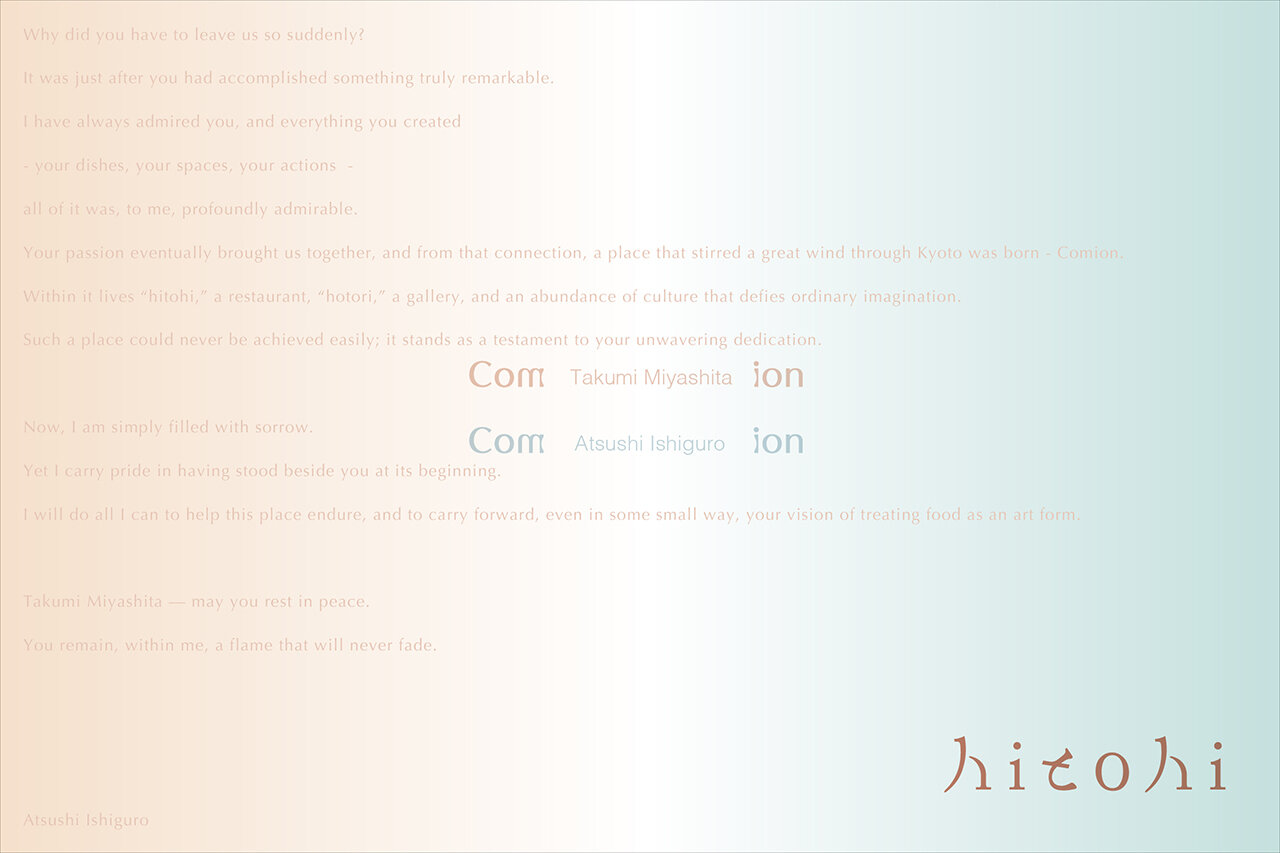
“Hito” and “hi” — people and people, fire and fire.
Two forces that have, since ancient times, connected us, warmed us, and colored our lives, now brought together in a single word.
The logo carries gentle curves reminiscent of a flickering flame, embracing within it the forms of the kanji “人” (person) and the hiragana “と” (and).
It shapes the warmth of people gathered around a table, the comfort of sitting by the fire, and reflects the memory of places where “person and person” and “person and fire” come together.
It is not merely a mark, but a vessel for the temperature and air of time spent together—
a sign that, each time you see it, quietly rekindles moments of warmth.
CL : HIGASIYAMA KIKAKU
CD : Takumi Miyashita
AD+D : Atsushi Ishiguro / @ai_ouwn
PH : Chisato Tende